
Research
Conducted desktop research by browsing different dental websites on mobile viewport such as Q&M Dental, Sunshine Dental and Orange Dental.
What I observed from the websites are:
- menu icon at the top corner
- navigation bar for some link is at the bottom of the screen which easier for users to tap as it is near the thumb
- booking page collects important information such as date, time, and services. The booking form has a few interactions such as typing and selecting
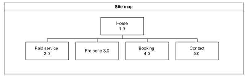
Happy Smiles Dental Sitemap
Prototype
Three Design Patterns Application
- Grids of Equal
- Accordion
- Cards
How I would redesign?
- To loyal patients, I should create an account page so when they book through the website, it will automatically fill in their contact details.
- Have one page for one service. this way, I can add FAQ section for each service and also a section for them to explore more services.
- Since there is a pro-bono service, I should have a pop up to confirm for them to get pro-bono service or general public.